Scholastic Identity Rework
Scholastic is a brand that represents an initiative to get people of a younger audience to read and an even bigger initiative to bring literacy to all parts of the world. This logo is an owl mixed together with a book, owls represent intelligence and a willingness to learn, the single color palette for this Identity redesign is in the same thought bubble as the owl, color that represents growth to come.
Check out some of my other work

S Collective
Branding, Social Media

Graham Hart
Cartography, Brand Strategy

Digital Ads
Web Advertising
Collection

Immergent
Branding
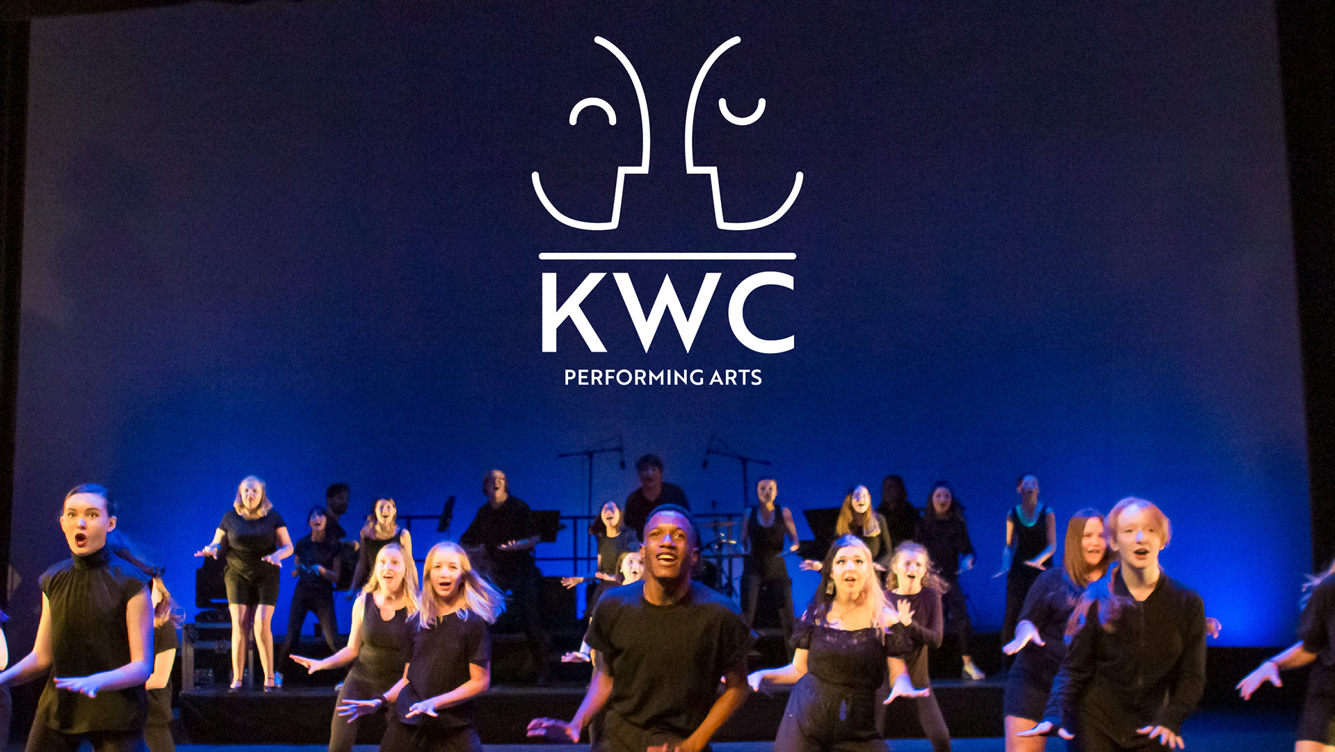
KWC Performing Arts
Rebrand
2022 Hermes Award Winner

Interrupting Pathways to Mass Violence
Event Branding

Come Play in Garland
Awareness Campaign

Fort Worth ISD
Recruitment

Samson Park
Branding, Outreach, Awareness
2024 Addy - Revolutionary Human Award

American Institute of Stress
Motion Graphics, Print